
At some point, almost every business lands on the same conclusion: they need a rebrand. It usually comes up when things start to feel stale, inconsistent, or just not quite right. But more often than not, what they actually mean is much simpler than that—“we need a new logo.”
It’s an understandable reaction, and even experienced teams fall into it. The logo is the most visible part of the brand. It shows up everywhere, it’s easy to recognize, and it feels like the clearest way to signal change. When something feels off, replacing the logo gives a sense of momentum. It’s immediate, tangible, and it creates the impression that real progress is being made because you can physically point to something and say, “that’s what’s new.”
But that’s exactly where the misunderstanding happens. A new logo, by itself, isn’t a rebrand. It’s a design update—simple as that. It may change how the brand looks on the surface, but it doesn’t go anywhere near the deeper work of defining positioning, refining messaging, or shifting how the brand is actually perceived in the market.
So when a logo change gets treated like a full rebrand, what usually ends up happening is a surface-level fix applied to a much deeper issue. The outside gets a fresh coat of paint, while the underlying lack of clarity—the thing actually causing the friction—stays completely untouched.
The recent Cracker Barrel rebrand is a solid example of this disconnect in action. The company introduced a simplified logo as part of a modernization effort, but it was quickly received as a full “rebrand” by the public, triggering confusion and backlash around what the brand was becoming versus what people felt it already was.
What the reaction really highlighted wasn’t a design issue—it was a clarity and perception issue. The conversation wasn’t about the quality of the logo, but about what it signaled. And when that signal didn’t match public expectation, the change didn’t land the way it was intended. The company ultimately reverted back, reinforcing that the real challenge wasn’t the visual update itself, but the lack of alignment between brand identity and audience perception.
The Root of the Confusion
The confusion usually starts with how loosely branding language gets used today. In everyday conversations, terms like “brand,” “identity,” “logo,” and “design” get tossed around as if they all mean the same thing. They don’t—but because they’re often used interchangeably, the distinctions between them start to fade, and the strategy behind them gets lost in translation.
In reality, each of these elements operates on a completely different level. Your brand is the overarching system—it’s how people perceive you, whether you’ve intentionally shaped that perception or not. It includes your positioning in the market, your values, your messaging, and the personality you present to the world. It’s the full picture of who you are as a company, not just how you look.
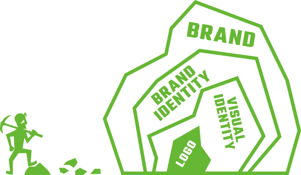
Your visual identity, on the other hand, is just one part of that system. This is where your logo lives, along with your colors, typography, imagery, and overall design language. It’s the expression of your brand—not the definition of it. Good visual identity takes what your brand already is and translates it into something people can see, recognize, and remember.
The problem shows up when these layers get blended together. When there’s no clear understanding of what each piece actually does, businesses start to believe that changing their visuals—most often the logo—will somehow change the brand itself. But appearance and identity are not the same thing, and one doesn’t automatically fix the other.
A new look can refresh how something is presented, but it doesn’t rewrite how it’s understood.
What a Rebrand Actually Means
A rebrand isn’t a visual exercise—it’s a strategic one. Before anything design-related comes into play, it starts with getting clear on the fundamentals of the business:
- Who you are in the market
- Who you’re for
- Why you matter
- How you’re different
That clarity becomes the foundation for everything else. It shapes your messaging, your tone, your customer experience, and eventually, how all of that gets expressed visually.
A true rebrand shifts perception because it changes the substance behind the brand, not just its appearance. Without that internal shift, the visuals might change—but the brand itself doesn’t.
Where Your Logo Fits Into the Equation
A logo lives inside your visual identity, and its job is pretty straightforward: to identify the brand and support recognition. That’s it. It’s not there to explain everything about the business or carry the weight of the entire brand on its own.
Your visual identity as a whole—things like color, typography, imagery, and layout systems—exists to create consistency and make the brand recognizable across every touchpoint. When it’s done well, it builds familiarity and reinforces who you are every time someone interacts with your business.
But even that system is still just an expression of something deeper. It’s the output, not the foundation. A logo can’t clarify your positioning, define your values, or fix inconsistent messaging. It can only reflect those things—and only if they’re already clearly defined in the first place.
Why Changing a Logo Rarely Fixes the Problem
When a business feels “off,” it’s rarely because the logo itself is the problem. The logo is usually just the easiest thing to point at, not the real source of friction. More often, what’s actually happening sits much deeper in the business.
You typically see issues like:
- Inconsistent messaging
- Lack of differentiation
- Unclear audience focus
- Internal misalignment
Those are all strategy problems—not design problems.
Updating the logo without addressing those foundations might create a short-term sense of progress, like something has been fixed or improved. But in reality, it doesn’t change how the brand is understood in the market. And without a shift in perception, there’s no meaningful rebrand happening—just a visual update.
In many cases, companies end up circling back later to redo the work properly once the underlying direction is finally clear.
What Strong Brands Look Like
Strong brands tend to work in the opposite direction of what most people assume. They don’t start with how they look—they start with what they mean. That meaning shows up through a clear position in the market, a distinct voice and personality, and a consistent experience across every touchpoint. Once that foundation is in place, visual identity stops being a guessing game and becomes a translation of something already well-defined.
When that foundation is solid, everything else tightens up. Design decisions feel intentional instead of subjective, consistency happens more naturally across channels, and recognition builds over time because the brand is reinforcing the same idea in a clear, repeatable way. The logo works in that context because everything around it is doing its job—not because it’s carrying the weight on its own.
A real rebrand follows the same logic. It aligns strategy, expression, and experience so they all point in the same direction. That typically shows up in clearer messaging, a more consistent tone and voice, stronger internal alignment, and a visual system that reinforces the strategy instead of trying to replace it. The logo may evolve as part of that process, but it’s the outcome of the work—not the starting point. Because at its core, a rebrand isn’t about looking different. It’s about being different, and making that difference unmistakably clear.
Final Thoughts
A new logo can absolutely refresh how your brand looks. It can modernize things, tighten up your presentation, and give you something that feels more current on the surface. But a rebrand goes a step further than that—it reshapes how your brand is understood in the first place.
If your brand feels inconsistent, outdated, or disconnected, the issue usually isn’t just visual. It’s clarity. It’s alignment. It’s knowing exactly who you are, who you’re for, and what you stand for—and making sure that shows up consistently everywhere your brand lives.
That’s where the real work happens. Start with clarity. Build the foundation. Then design something that actually reflects it.
And when that kind of work is needed, it’s rarely just about aesthetics—it’s about getting the strategy and expression to finally match. That’s the difference between a new look and a real rebrand, and it’s exactly where strong brands (and the right partners) make the shift.